


 Key Findings
The teams that generate consistent pipeline layer several maps on one list: segmentation for the right accounts, signal mapping for the right moment, pain mapping for the right message. Each layer compounds into higher reply rates.
A fitting account with no active signals is low priority. That same account announcing funding, hiring a key role, and visiting your pricing page is red hot. At Reachly, signal-based targeting lifts positive reply rates from 1 to 2 percent up to 8 percent or above.
A typical B2B purchase involves 5 to 15 stakeholders. Reach one and the deal is a single point of failure. Map the economic buyer, the champion, the end user, and the likely blocker before the first message.
LinkedIn for social proof, email for value, phone for qualification, in the right order and cadence. Reachly campaigns running this coordinated touchpoint map outperform single-channel campaigns by 30 to 40 percent on positive reply rate.
Refresh the data layer continuously via Clay and LinkedIn Sales Navigator alerts, and review the strategic layer every quarter. Intent signals decay in two to four weeks, so a static map slowly decays your reply rate.
You cannot hit a target you cannot see, yet most B2B outbound runs exactly that way. Generic messages fired at a flat list, budget burned, and silence from the people who might have bought. The missing ingredient is precision, and a market map is how you build it.
A market map is a data-backed picture of your market that shows who to target, why they will reply, and when to reach out. This guide gives you nine market mapping examples you can build this week, the exact way Reachly builds each one across 1,000+ campaigns, and a free template to copy. Every map below turns a flat prospect list into a ranked, timed pipeline. Start with the one your team is missing.
TL;DR: Summary
- A market map is a layered view of your total addressable market that shows who to target, why they will reply, and when to reach out.
- Nine map types cover the job: positioning, TAM segmentation, competitor, buying stage, buying committee, buying signal, ABM territory, channel, and value driver.
- A first working map takes six steps and about a week. Start from closed-won accounts, never from a blank grid.
- Fit tells you who to contact. Signals tell you when. A map without a signal layer is a prettier list.
- Score every account, set a threshold it has to clear, and refresh the data quarterly, because a map nobody owns becomes fiction within a quarter.
- The copy-paste template below turns the map into 12 spreadsheet columns you can fill in today.
- Reachly builds this map at the start of every engagement before a single email goes out. See outbound lead generation services.
What is market mapping?
Market mapping is the process of laying out a market visually so you can see where the opportunity sits. In its oldest form it is a positioning map: two axes, a scatter of competitors, and the gaps between them. In its modern B2B form it is a layered view of your total addressable market that combines firmographics, buying signals, competitor positioning, and stakeholder roles into one shared picture your sales and marketing teams work from.
The point is not a tidy grid of logos. The point is finding the space where you are not fighting everyone, then reaching the accounts in that space at the moment they are ready. A prospect list tells you who exists. A market map tells you who to contact, in what order, and with what message. That is the difference between guessing and a repeatable outbound lead generation system.
Reachly's guide to sales prospecting techniques starts its four-step process in the same place: research and list building, before any outreach goes out.
What are the advantages and disadvantages of market mapping?
Used well, a market map earns its place fast. It concentrates spend on the segments most likely to buy, surfaces the white space competitors have left open, times your outreach to real buying windows, and gives everyone from the SDR to the founder one version of who matters and why. Those are the advantages every team feels within a quarter.
The limits are worth naming too, because a map is only as good as its inputs and its upkeep. A map built on stale data points you confidently at the wrong accounts. A map that nobody owns becomes fiction within a quarter as buyers change jobs and competitors ship new products. And a map with no scoring layer is just a prettier list. Treat the sections below as living systems, not one-time slides, and the disadvantages mostly disappear.
What are the nine B2B market mapping examples?
Here is how the nine maps compare on effort and payoff, so you can pick where to start. The rest of the guide builds each one.
| Map | Effort | What it answers | Best for |
|---|---|---|---|
| Positioning map | Low | Where do we sit versus rivals on two axes buyers care about | Messaging and differentiation |
| TAM segmentation map | Medium | Which segments of the market deserve our effort | Coverage sizing, scaling campaigns |
| Competitor map | Medium | Who is vulnerable to switching and where the white space is | Win-back and switch campaigns |
| Buying-stage map | High | Who is early, comparing, or ready to decide | Cadence and content timing |
| Buying committee map | High | Who signs, champions, uses, and blocks the deal | Complex multi-stakeholder deals |
| Buying signal map | Medium | Which accounts are in-market right now | Timed, signal-based outreach |
| ABM territory map | High | How to work a named list of high-value accounts | Enterprise and strategic deals |
| Channel and touchpoint map | Medium | Which channel to use, in what order, at what cadence | Multichannel outbound programs |
| Value and pain point map | Medium | What outcome each buyer actually wants | Messaging and objection handling |
1. The classic positioning map
This is the market map most people picture when they hear the term, and it is where the searches for examples usually land. You draw two axes that represent what buyers actually weigh, then plot every player on the grid. For a payroll-software market you might use price on one axis and setup complexity on the other. Cheap and simple tools cluster in one corner, expensive and complex platforms in another, and the empty quadrants are the openings.
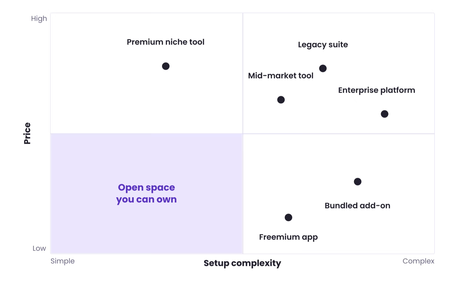
The value is in the gaps. If every competitor sits in the high-price, high-complexity corner, a fast, affordable option has clear air to own. A positioning map keeps your differentiation honest, because it forces you to name the two dimensions your buyers care about most and prove you sit somewhere distinct. Build it in a spreadsheet or a slide, pick axes from real buyer language, and plot six to ten named rivals.
2. Total addressable market (TAM) segmentation map
Before you sell, you need to know who is out there to sell to. TAM segmentation breaks your entire potential market into defined groups by industry, company size, revenue band, and geography. It is the most fundamental of these market mapping examples because every campaign inherits it. A vague TAM produces vague results.
Mapping the market once is a project. Keeping that map live, enriched, and scored as accounts change is GTM engineering, and it is the layer that turns a static map into campaigns that actually send.

Without this map you waste sending capacity on accounts that will never convert. With it, you point effort only at the segments with the highest revenue potential. When Reachly onboards a client, the first thing we do is map their TAM in Clay, pulling firmographic and technographic data from several sources, then segmenting into three to five high-confidence buckets before we write a single sequence. Layer live buying signals like recent funding or a key hire on top of the static segments, and the map tells you who to target and when. Go deeper in our modern guide to B2B segmentation.
- Define 3 to 5 high-confidence segments using your existing closed-won customers as the pattern.
- Enrich the data with a tool like Clay to validate assumptions before you scale.
- Track segment performance by reply rate, meetings booked, and deal size, then double down on what works.
3. Competitor map
Knowing your market is half the picture. Knowing your competition is the other half. A competitor map plots how rivals position on price, features, and target buyer, and it shows you who is vulnerable to switching. Without it, your differentiated messaging sounds like everyone else's.
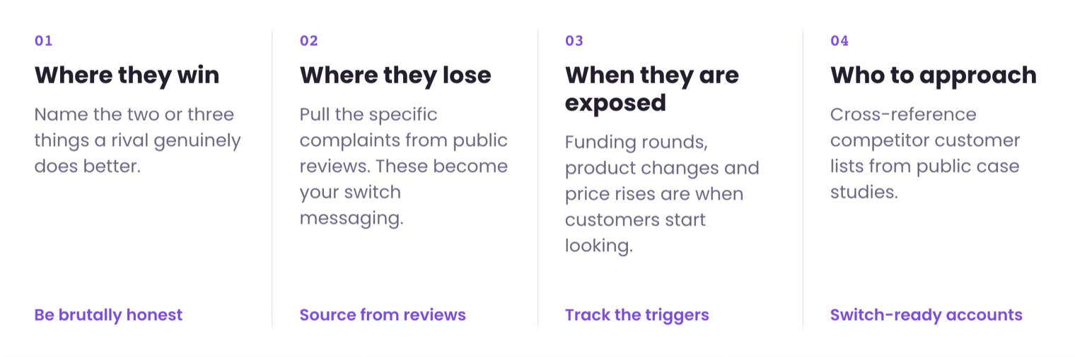
Get brutally honest about where you win and where you lose. Track competitor funding rounds, product updates, and negative reviews, because those are the moments a rival's customers start looking. Then write switch messaging that names the specific pain of the tool they already use, rather than a generic we-are-better claim. Cross-reference competitor customer lists, found through public case studies or technographic tools, against your target accounts to build a high-intent switch segment.
- Pick 4 to 6 decision dimensions your buyers actually use, like ease of setup, integrations, or price.
- Watch for switch signals such as price rises, outages, or leadership changes at a competitor.
- Write pain-specific switch copy tied to the tool the account runs today.
4. Buying-stage map
Knowing who to target is only half the battle. Knowing when, and with what message, is what separates outreach that converts from outreach that gets ignored. A buying-stage map plots prospects from early awareness to active decision using live signals, so your message matches their context instead of demanding a demo from someone who just learned the problem exists.
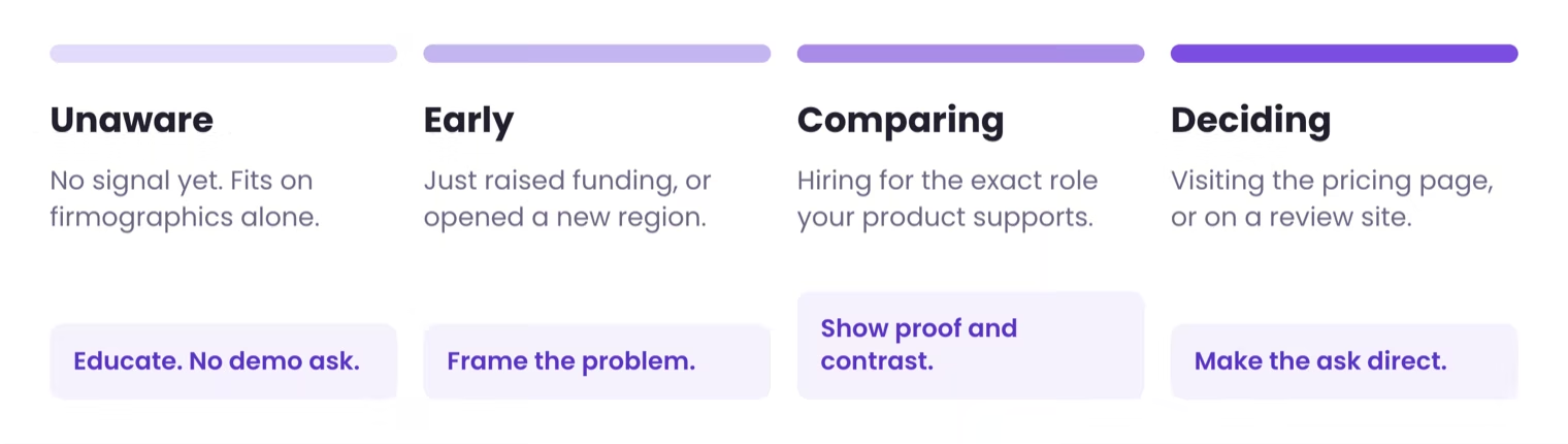
For every client campaign, Reachly builds a signal-to-stage map before writing a line of copy. A company that just raised funding is early for most solutions. A company hiring for the exact role your product supports is comparing options. A company visiting your pricing page is deciding. Each stage gets a different message, a different channel mix, and a different call to action, which is why staged campaigns beat one-size-fits-all outreach.
- List 2 to 3 concrete triggers per stage, for example a key new hire for early awareness, competitor research for comparison.
- Match content to stage so an early-stage account gets education, not a pricing sheet.
- Automate the sequences with Smartlead or HeyReach so touches trigger on engagement.
5. Buying committee role map
A deal rarely closes on a single yes. An average B2B purchase now involves five to fifteen stakeholders, so if your outreach reaches only one of them, your deal is a single point of failure. A buying committee map identifies every stakeholder, their priorities, and the objections each will raise, moving you from single-threaded hoping to multi-threaded selling.
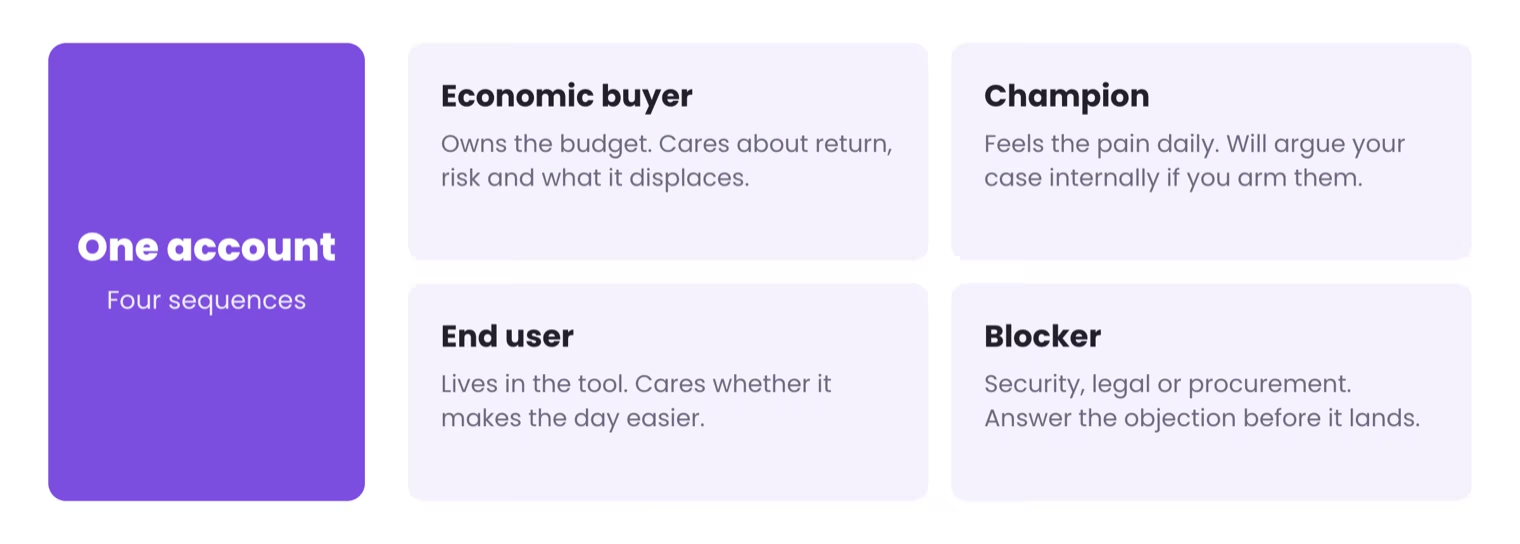
Reachly maps the committee for every client campaign before outreach begins. Using LinkedIn Sales Navigator we identify the economic buyer, the champion, the end user, and the likely blocker at each target account, then give each a different sequence and value proposition. This is one of the main reasons our clients see higher meeting show rates and faster deal progression than single-contact campaigns. It is also the backbone of serious LinkedIn lead generation.
- Find the roles in each target account with LinkedIn Sales Navigator: heads of department, VPs, directors, managers.
- Personalize by role, so the CFO gets ROI and the end user gets a short product proof.
- Prioritize the economic buyer and frame outreach around the outcomes they own.
6. Buying signal map
Knowing who to target is half the battle. Knowing when to target them is what books the meeting. A buying signal map tracks the behaviours that show a prospect is actively evaluating a purchase, like recent funding, key hires, or a change in their tech stack. This is not static firmographics. It is the timing layer, and it is the single highest-impact map an outbound team can build.
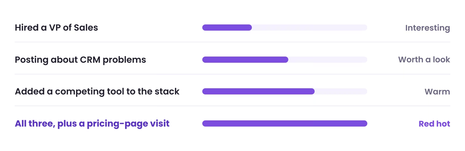
A single signal is a guess. A cluster of signals is a qualified opportunity. A company hiring a VP of Sales is interesting. That same company also posting about needing a new CRM and visiting your pricing page is a red-hot lead. Reachly uses Trigify for LinkedIn engagement signals, RB2B for website visitor identification, and Clay to aggregate funding and hiring surges from several sources at once. For Primal we ran five separate campaigns, each triggered by a different signal, and they hit an 8 percent positive reply rate within the first month, up from the 1 to 2 percent a fit-only list produces. The full method is in our signal-based outbound guide and the data side in our B2B intent data breakdown.
- Pick 3 to 5 core signals such as key hires, funding, or competitor mentions.
- Prioritize recency, because intent signals decay in two to four weeks. Work the last 14 to 30 days.
- Reference the signal in the opener so the message reads as timely, not templated.
The campaigns that perform best are usually the niche ones. We have run campaigns into garment manufacturing facilities in North America and India, churches, brokers. Less cold email lands in those inboxes. And if your ICP insists on speaking only to the CEO, remember that CEOs and CROs of funded startups get 60 to 70 cold emails a week. They are not reading their inbox. Map the buying committee and work it.

7. Account-based marketing (ABM) territory map
Broadcasting generic messages to wide segments gets you ignored. An ABM territory map flips that by organising a small list of high-value accounts into strategic territories. Instead of casting a wide net, you spearfish. This is the map for longer deal cycles and higher contract values, where you focus all your firepower on the accounts with the best fit and highest revenue potential.
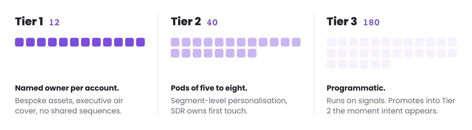
ABM moves the question from how many leads did we get to how deeply are we engaged with our top hundred accounts. A good territory map aligns the whole revenue team on which accounts matter, who owns them, and how the SDR and account executive hand off without dropping the deal. Build account-specific assets, because generic outreach into a named list gets deleted.
- Select 50 to 100 highest-fit accounts that match your ICP tightly.
- Rank them with predictive or signal scoring, not just firmographics.
- Coordinate the SDR and AE handoff on a written engagement timeline, because a clumsy handoff kills deals.
8. Channel and touchpoint map
Knowing who to target is only half the battle. Knowing how and when to reach them is the other half. A channel and touchpoint map lays out the ideal sequence of interactions across cold email, LinkedIn, and cold calling. Instead of hitting prospects on every channel at once, you build a coordinated sequence that respects their attention and protects your sender reputation.

Use each channel for what it does best: LinkedIn for social proof, email for detailed value, the phone for direct qualification. Every campaign Reachly runs follows a documented touchpoint map. Day one is a LinkedIn connection request via HeyReach plus a personalized cold email via Smartlead. Day three is a LinkedIn profile view. Day five is a follow-up email with a relevant proof point. Day eight is a second LinkedIn touch. Day twelve is a final email with a direct ask, then a call. That order is not arbitrary. It comes from data across hundreds of campaigns, and coordinated touchpoint structures consistently outperform single-channel campaigns by 30 to 40 percent on positive reply rate.
- Design distinct sequences per persona, since an enterprise buyer and a mid-market manager prefer different channels.
- Protect deliverability with dedicated domains and mailboxes warmed via ZapMail.
- Watch unsubscribe and reply sentiment, and dial back cadence the moment either turns negative.
9. Value driver and pain point map
Your product features do not sell. The outcomes they deliver do. A value and pain point map connects what your product does to what your buyer actually needs, so every email speaks to a real motivation: hitting quota, closing a security gap, or proving marketing return. Without it, your outreach is generic and easy to ignore.
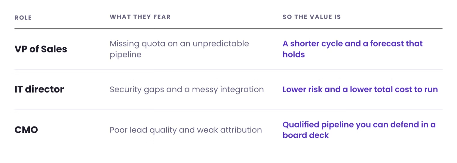
See the world through each role's lens. A VP of Sales fears quota risk and an unpredictable pipeline, so your value is a shorter cycle and reliable forecasting. An IT director fears security gaps and messy integrations, so your value is lower risk and total cost. A CMO fears poor lead quality and weak attribution, so your value is qualified pipeline and defensible return. Every piece of Reachly copy starts with a pain point mapped to a buying signal, opens on that pain, connects it to a specific outcome we have delivered, and ends with a question that is easy to answer. That is why our campaigns hold positive reply rates above 8 percent across very different client ICPs.
- Interview 10 to 15 target buyers about goals and pressures, without pitching.
- Map each pain to a metric, turning inefficient prospecting into ten hours a week lost to manual research.
- Quantify value in proof points, such as a client that cut its sales cycle by 30 percent.
How do you create a market map, step by step?
You do not need a consultant or a quarter to start. A first working market map takes about a week if you run the steps in order. Copy the six-step build below, then lift the template table into whatever tool your team lives in, a spreadsheet, Notion, or your CRM.
What does a free market mapping template look like?
A working market map is 16 columns in a spreadsheet. Copy the schema below into Google Sheets, Notion, or your CRM, then fill one row per account. The scoring columns are the part most teams skip, and they are the part that turns a list into a queue your reps can work top down.
Keep the two score columns capped at 40 each and reserve the last 20 points for a warm path in, a shared investor, a former colleague, or an existing customer in the same group. That weighting stops a strong signal on a poor-fit account from jumping the queue.
Column             | What goes in it                            | Example
-------------------|--------------------------------------------|--------------------
Account            | Company legal name                         | Northbeam Logistics
Segment            | Which of your 3 to 5 TAM buckets           | Mid-market 3PL
Employees          | Headcount band, not an exact number        | 201-500
Revenue band       | Best available estimate                    | 25M-50M
Region             | Sales territory, not the HQ country        | APAC
Positioning axis X | First axis buyers weigh                    | High service
Positioning axis Y | Second axis buyers weigh                   | Legacy stack
Fit score 0-40     | Match against closed-won patterns          | 32
Signal             | The event that makes now the moment        | Hired a VP Ops
Signal score 0-40  | Recency and strength of that signal        | 35
Committee          | Economic buyer, champion, user, blocker    | COO, Ops Lead, IT
Pain per role      | The outcome each named role is judged on   | COO: cost per load
Total score 0-100  | Fit plus signal plus 20 for a warm path    | 79
Tier               | A above 70, B 50 to 70, C below 50         | A
Owner              | The person who keeps this row true         | Maya
Next review        | Date this row gets checked again           | 2026-12-01
How do you turn a market map into pipeline?
We have walked through nine market mapping examples, from a plain positioning grid to the pain points of a single buyer. A prospect list is a starting point. The real work is turning that raw list into a map that guides every action your team takes.
Individually, each map is useful. Layered together, they build a system. You move from let us email some tech companies to let us target Series B fintechs in APAC whose heads of sales just engaged with content about fraud detection, and send them a message about the exact problem that hire was brought in to solve. The second is a calculated move, and it comes from the same discipline behind how we qualify leads before a rep ever touches them.
The quality of your pipeline is a direct reflection of the quality of your map. Keep it live, score it strictly, and refresh the data every quarter. That is the machine Reachly runs as a done-for-you service across cold email, LinkedIn, and cold calling. It produced 85+ qualified leads in six months and a 4.57x return for Primal, with an 8 percent average positive reply rate. If you would rather your map produced meetings than slides, see how the pieces fit in our modern outbound sales strategy guide, run the numbers through the ROI calculator, or hand it to our outbound lead generation team.
We build the map, then work it
Reachly maps your TAM across 10+ data sources, scores every account on fit and live buying signals, and runs the cold email, LinkedIn, and cold calling that follow. Primal got 85+ qualified leads in six months and a 4.57x return.
See how it works
Market mapping FAQ
What is market mapping?
Market mapping is the process of laying out a market visually so you can see where the opportunity sits. In its classic form it is a positioning grid that plots competitors on two axes buyers care about. In modern B2B it is a layered view that combines segments, competitor positioning, buying signals, and stakeholder roles into one picture that tells you who to target, when, and with what message.
What is a good example of market mapping?
The simplest example is a positioning map: plot every rival on price versus setup complexity and look for the empty quadrant you can own. For outbound teams, the highest-impact example is a buying signal map that flags accounts showing funding, hiring, or pricing-page visits, so you reach them while they are in-market rather than months later.
What are the benefits and disadvantages of market mapping?
The benefits are sharper targeting, visible white space, better timing, and one shared view of the market for the whole team. The disadvantages come from neglect: a map built on stale data misleads you, a map nobody owns goes out of date within a quarter, and a map without a scoring layer is just a longer list. Keep it live and scored and the downsides mostly disappear.
How do I build a market map for B2B outbound?
Start from your closed-won accounts, segment the TAM into three to five buckets, plot the positioning and competitor axes, then layer live buying signals on top. Map the buying committee and the pain each role feels, score every account on weighted fit and signals, and set a threshold reps must clear. Review the map quarterly. A first version takes about a week in a tool like Clay.
Is there a free market mapping template?
Yes. The template in this guide gives you eight rows to fill in: segment, positioning, competitor, buying stage, committee, signal, pain and value, and score. Copy those rows into a spreadsheet, Notion, or your CRM, add one column for the account and one for the data source, and you have a working market map you can run campaigns from.
How often should I update a market map?
Review the strategic layer, your segments, priorities, and messaging, every quarter. Update the data layer continuously, because intent signals decay in two to four weeks and any list older than 30 days starts accumulating bounces and out-of-date titles. Automated workflows in Clay and saved-search alerts in LinkedIn Sales Navigator keep the data fresh without manual work.
What are common mistakes in market mapping?
Four cost the most: mapping the whole market rather than the segment you can realistically win, working from stale firmographic data, building the map once and never refreshing it, and mapping companies without mapping the buying committee inside them. A map nobody updates quarterly stops being useful within two quarters.
What are the types of market mapping?
Nine show up regularly in B2B: positioning maps, TAM segmentation maps, competitor maps, buying-stage maps, buying committee role maps, buying signal maps, ABM territory maps, channel and touchpoint maps, and value driver maps. Most teams need two or three rather than all nine. Start with a TAM segmentation map and a signal map.
How do you do market mapping in sales?
Start with the accounts you have already closed and pull out their shared attributes. Use those to filter the total market down to a working list. Enrich that list with technographics and one trigger signal, score every account against your ICP, then split the top tier across reps as named territory. Rescore each quarter.
What does market mapping look like?
In practice it is a spreadsheet or a CRM view. Each row is an account, and the columns carry segment, headcount, tech stack, buying stage, most recent signal, and owner. The two-axis positioning chart people picture is the presentation version, useful for a board. The table is the version your reps actually work from.
How long does it take to build a market map?
A first working market map takes about a week: a day to pull closed-won patterns and segment the TAM, two days to enrich and score accounts, and the rest to layer signals and assign owners. Reachly builds one at the start of every engagement before any campaign goes live, then refreshes the signal layer every quarter.
What is the difference between a market map and a positioning map?
A positioning map is one type of market map. It plots competitors on two axes buyers care about and answers where you sit against rivals. A market map is the wider system: segmentation, competitor positioning, buying stage, committee roles, signals, and scoring, held as a table your reps work from rather than a slide.
What tools do you need to build a market map?
A spreadsheet covers the first version. Beyond that, Clay for enrichment and scoring, LinkedIn Sales Navigator for committee mapping, and a signal source such as funding, hiring, or technographic data. The tool matters less than the scoring rule, because an unscored map in an expensive platform is still a list.
Recommended service
Outbound Lead Generation Services
Reachly builds and runs the whole outbound motion across email, LinkedIn, and phone, and books qualified meetings on your calendar.