



Compare b2b data providers by verified contacts, regional coverage, and cost per usable lead—not database size or raw credits.
If you are comparing b2b data providers, the right question is not “who has the biggest database?” It is “who gives me the most verified contacts for my ICP, in my region, at a usable cost?” On live outbound lists, one provider alone usually matches about 60% of rows. A 3-provider waterfall takes the same list into the 90s. That is the difference between a campaign that ships and a campaign that stalls before day one.
That also means a feature checklist is the wrong way to buy data. What matters is coverage by market, verified output, refresh speed, and what each contact actually costs after verification.
How should you compare b2b data providers?
Start with one definition and keep it fixed across every test.
A usable contact is a record that matches the right account, the right person, the current role, and a work email that verifies before send. If you sell by phone first, add a valid mobile number to that definition. If you sell through cold email, LinkedIn, cold calling, the verified email carries more weight than the phone field.
Most teams compare raw credits. That misses the point. A cheap provider with weak match coverage or poor verification accuracy gets expensive very fast. Reachly looks at cost per usable contact, not cost per credit, because mobile numbers often cost 5 to 10 credits on many plans and still do not book the meeting on their own.
After you fix the definition, compare providers on four numbers:
- Usable contact: right person, right company, verified work email, current role
- Match rate: usable contacts returned divided by ICP rows tested
- Verification pass rate: returned emails that clear verification before send
- Cost per usable contact: provider spend divided by verified emails returned
That last one is the number that survives procurement decks and real sends.
Which b2b data providers return the most usable contacts?
On Reachly’s side, the buying pattern is a 3-provider waterfall: Icypeas first, Prospeo second, BetterContact third. The logic is simple. Provider two only sees the rows missed by provider one. Provider three only sees the rows missed by the first two.
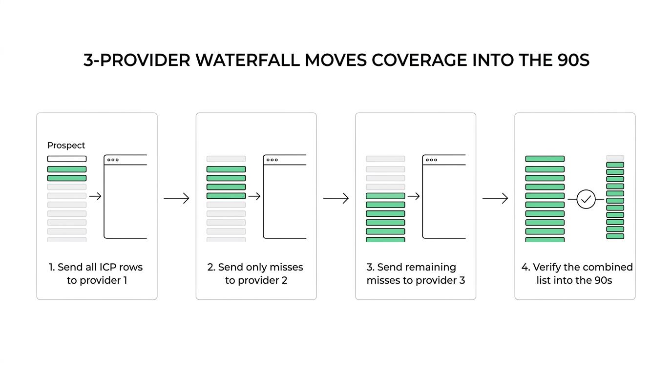
That structure matters because it changes how you measure performance. You do not judge provider two on the full list. You judge it on incremental verified contacts added to the missed rows.
[markdown] | Provider | Figure attached | Where it sits | How Reachly measures it | What it is expected to do | | --- | ---: | --- | --- | --- | | Icypeas | 1 of 3 | First pass | Cost per usable contact on 100% of test rows | Get the highest share of obvious matches fast | | Prospeo | 2 of 3 | Second pass | Incremental usable contacts on Icypeas misses | Recover good rows the first pass missed | | BetterContact | 3 of 3 | Third pass | Incremental usable contacts on remaining misses | Push total coverage from the 60s into the 90s | [/markdown]The useful comparison is not vendor one versus vendor two in isolation. It is what each one adds after the previous pass. That is why a provider that looks average on paper can be worth buying in position two or three.
Reachly’s own operating notes are blunt on this point. One provider alone gets about 60% match coverage. A three-provider sequence takes the same list into the 90s. If coverage matters, a single-vendor test gives you the wrong answer.
How do region and segment change b2b contact data provider performance?
Coverage moves with geography and company type. US software lists are usually easier than founder-led services firms in APAC. Public headcount data is easier than privately held companies with sparse digital footprints. SDR and marketing titles are easier than hybrid roles inside small teams.
That is why “best” changes by segment. A provider that looks strong on US SaaS may fall apart on ANZ professional services or APAC commercial real estate. If your TAM is narrow, one bad assumption about title normalization or company naming wipes out a big chunk of the list.
Company data providers and contact data providers solve different parts of the job. Company data tells you whether an account belongs in the TAM. Contact data tells you whether there is someone reachable inside that account. Reachly builds this in Clay across 10+ data sources because one source rarely gives both layers cleanly enough.
You should test providers on real ICP rows, split by region and segment, before you commit budget. A provider that returns 1,000 contacts from a broad US sample tells you very little if your next campaign targets 80 accounts in Singapore, Sydney, and Bangkok.
Why does verified output matter more than raw credits?
Because bad data does damage before it gets caught.
A provider does not get credit for returning an email that bounces, lands in spam, or belongs to the wrong person. That is dead weight on the list, and it hits domain reputation fast. Thibault Garcia, founder of Reachly, puts it plainly: “Every list gets verified twice. Bounce rate is the one number we refuse to be surprised by, because by the time it surprises you the domain is already damaged.”
Outside data supports that discipline.
[markdown] | Source | Year | Figure | Why it matters | | --- | ---: | ---: | --- | | Validity | 2025 | 1.5% global bounce rate for permission-based email marketing | Delivery alone overstates real inbox reach | | Validity | 2025 | Inbox placement rate is the better measure than delivery rate | Sent minus bounced is not enough | | Rodriguez-Esteban, Vishnyakova, and Rinaldi | 2019 | 18% of contact emails in MEDLINE were invalid | Email decay is real even in maintained datasets | | Rodriguez-Esteban, Vishnyakova, and Rinaldi | 2019 | 2.1% of contact emails turned invalid each year | Old lists rot even if the provider once matched them | | Reachly internal campaign data | 2026 | 95%+ email accuracy across 47 campaigns with waterfall verification | Multi-source verification beats single-source confidence | | Reachly internal campaign data | 2026 | 65% to 90% single-source accuracy range | One source alone leaves too much variance | [/markdown]This is why Reachly re-validates any list older than 3 months before send. A provider match is not a finished record. It is a draft until verification clears it.
If you care about deliverability, set hard filters early:
- bounce rate under 3%
- deliverability score above 97%
- re-validate lists older than 3 months
Those are operating thresholds, not nice-to-have metrics.
When does a multi-provider waterfall beat a single vendor?
A waterfall wins when the list matters enough that missed rows cost pipeline.
That usually means enterprise accounts, narrow TAMs, regional lists outside the US, or campaigns where each matched contact is expensive to replace. If your outbound motion depends on high account coverage, buying one provider and stopping there leaves reachable people off the board.
The mechanism is simple. Each provider has blind spots. Different crawlers, different source networks, different logic around titles, domains, and role mapping. When you route misses into the next provider, you are not paying twice for the same outcome. You are paying for the overlap gaps each source leaves behind.
The basic workflow looks like this:
- Start with 500 real ICP rows
- Pass 1: send all rows to Icypeas, provider 1 of 3
- Pass 2: send only unmatched rows to Prospeo, provider 2 of 3
- Pass 3: send only remaining misses to BetterContact, provider 3 of 3
Then verify the output before a single email goes live.
There is a caveat. A waterfall costs more in tooling and operator time. If you are working a founder-led list of 50 dream accounts, manual research often beats automation. If your average contract value is under $5,000, buying more data is usually the wrong problem to solve first.
What should you shortlist if you need contact data providers and company data providers?
Shortlist by motion, not by brand familiarity.
If your team sends cold email first, contact accuracy matters more than phone depth. If your motion starts with account selection and buying signals, the company layer matters first, then the contact layer gets filled in behind it. Reachly treats those as separate decisions inside one outbound system.
[markdown] | Need | What to buy first | Figure to watch | Why it matters | | --- | --- | ---: | --- | | Broad outbound into a large TAM | Contact data provider stack | Match rate from 60% toward the 90s | Coverage decides send volume | | Narrow enterprise list | Company data plus manual account review | Wrong-account rate | Bad account selection wastes every later step | | APAC or mixed-region campaigns | Region-tested provider mix | Verified output by region | US-heavy datasets skew results | | Signal-based outbound | Company layer tied to buying signals | List refresh within 2 to 4 weeks | Intent signal shelf life is short | | Deliverability-sensitive cold email | Verification layer before send | Bounce rate under 3% | Good data protects domains | [/markdown]That is also why Reachly does not treat data buying as a one-off procurement task. It sits inside the full outbound build, from TAM mapping to verification to reply handling. If you want the full operating picture, the stack behind that process is laid out in Reachly’s guide to outbound tools.
Proof matters here too. On Primal, Reachly helped produce 85+ SQLs in 6 months, a 4.57x ROI, and a 35% CAC reduction. On The Great Room, outbound meetings moved from 2 per quarter to 2 per month, with about $250K in contract value closed and zero added headcount. Data was not the whole story in either case, but weak data would have killed both campaigns early.
Who should not buy more b2b data yet?
If your current lists already verify cleanly and your reply rate is still flat, the problem is probably not provider coverage. It is usually the offer, the audience, or the ask.
Reachly has seen a Series A client sending 20,000 to 30,000 emails a month move from a 0.5% reply rate to 1%, then up to 1.6%, after changing the copy and offer. Same channel. Same motion. Better message. More data would not have fixed that.
You also should not buy deeper datasets if there is no sales process to multiply. Outbound ships in 3 to 4 weeks and tells you quickly whether the market cares. If there is no proof, no offer, and no clear ICP, a bigger contact file just gets you a cleaner version of the wrong list.
If you are vetting providers right now, run a 500-row bakeoff on real ICP accounts, calculate cost per usable contact, and keep only the vendors that raise verified coverage. If you want that built into a done-for-you system, Reachly’s outbound lead generation services, LinkedIn outreach agency, and appointment setting services tie data, targeting, and meeting booking into one process. The next step is simple: book the meeting with Reachly and bring the rows you actually plan to send.
The short version is this: buy verified output, not database claims. One provider gets you part of the way, a measured waterfall gets you much closer, and regional fit decides whether the numbers hold once you leave the US.
Key findings recap:
- One provider: about 60% list match coverage on its own
- Three-provider waterfall: the same list moves into the 90s
- Usable contact definition: right account, right person, current role, verified work email
- Verification rule: re-check any list older than 3 months
- Decision metric: cost per usable contact, not cost per credit