


Learn which outbound sales KPIs actually predict pipeline: positive replies, qualification, conversion, slippage, and cycle time.
If an outbound campaign has gone 1,000 emails with zero positive replies, you do not need more dashboard widgets. You need better lead generation KPIs. The right KPI set tells you whether outbound is turning cold email, LinkedIn, cold calling into qualified pipeline, and it tells you early enough to stop bad angles before they waste another month.
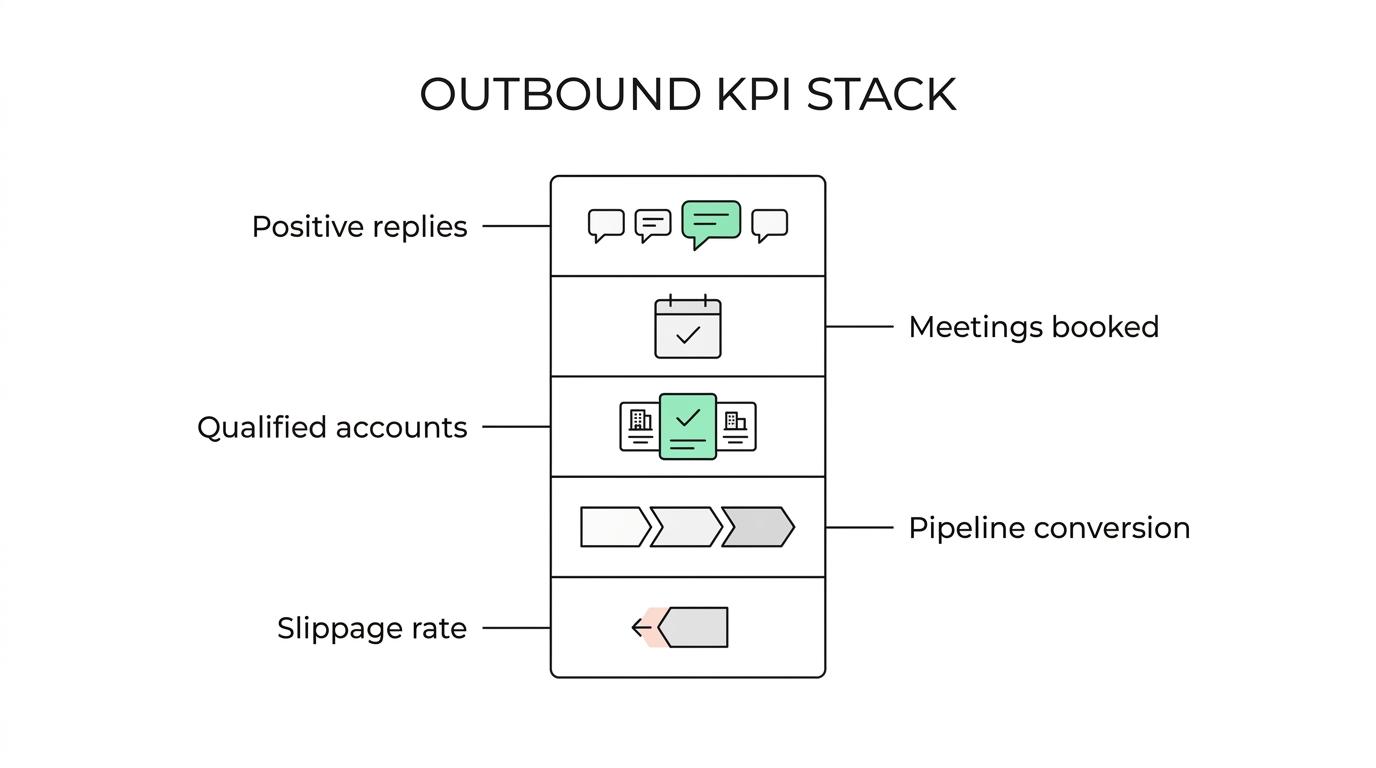
That changes what belongs at the top of the report. Positive reply rate, meeting booked rate from positive replies, qualified account rate, lead-to-opportunity conversion, pipeline conversion rate, pipeline slippage rate, and cycle time tell you what is happening. Sends, opens, connection volume, and dials mostly tell you that work happened.
This is the split that matters for outbound sales KPIs. Some metrics predict pipeline. Some just keep the team busy.
Why do lead generation KPIs go wrong so often?
Most dashboards get built from what the tools make easy to count.
Email tools show sends and opens. LinkedIn tools show connections. Dialers show call volume. CRM reports show meeting counts. None of that is useless, but it creates a reporting habit where activity sits above outcomes. Once that happens, weak campaigns hide in plain sight.
A better reporting model starts one level up. Whether you run outbound in-house or through a done-for-you outbound program, the KPI stack should answer one question first: is this work turning into qualified pipeline that moves?
The outside research points the same way.
[markdown] | Source | What it points you to | | --- | --- | | McKinsey, 2025 | A fully implemented gen AI sales solution led to 40 percent higher conversion and 30 percent faster lead execution over a few months. Conversion and speed matter more than raw activity. | | Gartner, 2026 | Track initial pipeline value, pipeline conversion rate, and pipeline slippage rate to judge pipeline health early. | | Forrester, 2026 | Derive the monthly pipeline needed to hit bookings from pipeline performance metrics, not seller inputs. | [/markdown]The same logic applies to sales development metrics. You still track inputs, but you report outcomes first and use inputs as diagnostics.
Which lead generation KPIs belong at the top of the report?
The cleanest way to do this is to report by layer. You want one inbox health signal, one conversation quality signal, one qualification signal, and a few pipeline signals.
[markdown] | Layer | KPI | What it answers | | --- | --- | --- | | Delivery | Overall reply rate, including out of office | Are you landing in inboxes and reaching real people? | | Conversation quality | Positive reply rate | Does the market care about the offer and angle? | | Conversion | meeting booked rate from positive replies | Can interest turn into meetings? | | Qualification | Qualified account rate | Are the people replying actually in your ICP? | | Sales handoff | Lead-to-opportunity conversion | Are booked meetings turning into pipeline? | | Pipeline movement | Pipeline conversion rate | Does outbound-sourced pipeline advance? | | Pipeline risk | Pipeline slippage rate | Is that pipeline stalling after creation? | | Speed | Cycle time | How long does outbound-sourced pipeline take to move? | [/markdown]There is a reason positive reply rate sits near the top. It is the fastest clean signal that the market is at least willing to engage. From there, meeting booked rate from positive replies tells you whether the team is handling interest well. Qualified account rate tells you whether the list and targeting are pulling in the right companies, not just any response.
The goal of cold email is a reply, not a meeting. No reply, no meeting.
That is why total replies can be misleading. You need to split replies into positive, neutral, objections, and removals. Reachly uses that breakdown because a campaign full of “not interested” replies is technically alive and commercially weak. If your team still argues over definitions, fix that first. Only 38.9 percent of companies have a formal definition of a qualified lead, which is part of why reporting gets messy. Reachly covers that in more detail in its guide to lead qualification.
The campaigns that hold up over time show their health in qualification and pipeline, not vanity activity. Primal produced 85+ SQLs in 6 months, 6 deals signed, and 4.57x ROI. The Great Room moved face-to-face meetings from 2 per quarter to 2 per month and closed a $250K contract with zero added headcount. Those are the numbers that matter.
If you need channel-specific ranges, keep them in a benchmark reference, not in the main KPI discussion. Reachly has that in its cold email benchmarks for 2026.
Which outbound sales KPIs are vanity metrics?
Vanity metrics are not fake metrics. They are real numbers that get promoted above their job.
They help you diagnose. They do not deserve headline status on a report that is supposed to explain pipeline creation.
- Open rate: Privacy protection made this too noisy to lead with.
- Emails sent: Volume without reply quality tells you very little.
- Dials made: Useful for rep activity, weak for pipeline prediction.
- Connection volume: Acceptance without replies is just access, not interest.
- Total replies: Lumps interest together with objections, removals, and noise.
You still keep these numbers.
You just move them down the page, where they support a diagnosis instead of pretending to be an outcome.
When should you stop an outbound campaign instead of changing it?
This is where most teams lose time. They keep changing copy when the campaign already crossed a stop line.
Reachly uses kill criteria. These are thresholds where you stop treating the problem like a tweak and start treating it like a failed angle, a broken list, or an infrastructure issue.
[markdown] | Failure signal | Threshold | What it means | What we do next | | --- | --- | --- | --- | | Angle test stalls | 1,000 emails sent, healthy overall reply rate, 0 positive replies | The market is rejecting the offer or audience | Stop the angle and rewrite the offer or list | | Campaign shows nothing | 3 weeks live with no traction | You need a fixed diagnostic order, not random edits | Check overall reply rate, inbox placement, then bounce rate | | Mailbox fatigue | Reply rate under 0.5 percent on a mailbox | The mailbox is getting tired before bounces tell you | Pull it out of rotation and rest it | | Data quality breaks | Bounce rate above 3 percent | The list or verification process failed | Stop sending and re-verify the data | | Domain dies | Blacklisted domain | That domain is done | Replace it with a warmed backup domain | | List is stale | List older than 3 months | Decay has already started | Re-validate before the next send | [/markdown]“Three weeks in with nothing to show, we go in a fixed order. Overall reply rate including out of office, then inbox placement tests, then bounce rate. If people are actively replying ‘not interested’, everything technical is fine and the offer is what needs work.”
Thibault Garcia, founder of Reachly
Garcia puts one of the key stop lines even more plainly: “We stop testing an angle after a thousand emails with no positive replies, assuming the overall reply rate looks healthy. At that point the market has answered you.”
That is the difference between reporting and wishful thinking. Your dashboard should tell you when to stop, not just when to keep sending.
How should you report sales development metrics each week?
Your weekly scorecard should fit on one screen. If it takes 20 minutes to explain, it is carrying too much noise.
After a short summary paragraph, a simple weekly view usually needs these line items:
- Pipeline created this week
- Positive replies by audience and offer
- Meetings booked from positive replies
- Qualified accounts created
- Stage conversion and slippage
- Top disqualification reasons
That structure forces the right conversation. If pipeline is down but positive replies are healthy, the issue is often qualification or follow-through. If positive replies are down across every segment, the problem usually sits with the offer, the audience, or inbox placement.
The first split is not by rep. It is by offer.
A Series A client sending 20 to 30k emails a month moved reply rate from 0.5 to 1 percent, then to 1.6 percent after switching to direct, question-based copy with a lead magnet and a better offer. Same channel. Same general motion. Different outcome. That is why the offer deserves its own line in the report.
You should also segment by source conditions that matter:
- By offer: free audit, sample work, lead magnet, direct pitch
- By audience: ICP segment, company size, geography, seniority
- By channel mix: cold email, LinkedIn, cold calling
- By timing: first touch, follow-up, re-engagement window
If you only report totals, you bury the answer inside an average.
What should you change this week if your dashboard is noisy?
Start by deleting nothing. Demote instead.
Put the predictive metrics at the top. Move activity metrics below them. Add stop lines next to the numbers so the team knows what action follows a bad read. That one change fixes a lot of bad meetings.
A simple reset looks like this:
- Keep at the top: positive reply rate, meeting booked rate from positive replies, qualified account rate, pipeline conversion rate, slippage rate
- Move down: opens, sends, dials, connection volume, total replies
- Add stop lines: 1,000 emails with no positive replies, bounce rate above 3 percent, mailbox reply rate under 0.5 percent
If you want a second set of eyes on the KPI stack behind your outbound lead generation system, Reachly can audit the reporting, the signal-based targeting, and the handoff into appointment setting. If the real issue is the offer, qualification logic, or mailbox health, it usually shows up fast. Book the meeting and we will walk through the scorecard with you.
The short version: the best lead generation KPIs measure reply quality, qualification, pipeline movement, and slippage. Activity metrics still matter, but they belong in the diagnostic layer, not the headline. When a campaign crosses a stop line, stop treating it like a copy problem and treat it like the market giving you an answer.